Building a CRUD App with React and Local Storage


Introduction
In this tutorial, we will be building a Task Manager App which has CRUD operation. The CRUD will involve creating, reading, updating, and deleting tasks. There will also be an additional dive in to the concept of Local Storage, which we will use to store our data.
Prerequisites
To get the most out of this tutorial, you need to be familiar with JavaScript since React is a JavaScript Framework. I wrote an article on what to learn before a JavaScript Framework like React here. So you can check it out to understand some basic things before going into this tutorial.
Goals
- You should be able to build any CRUD App like a note-taking app after this tutorial.
- You should be able to use React Hooks and understand some React concepts like states, props, and components.
- You should understand the concept of Local Storage and be able to use it in other React apps.
Final View of our App
The final view of our app is displayed below, and this was achieved by styling our app according to the user interface.
You can also view the final project live.


Project Installation and Set-up
Create React App
In this tutorial, we will start our project using create-react-app
You don't need to install or configure tools like webpack or Babel while using Create React App because they are preconfigured and hidden so that you can focus on the code.
create-react-app also sets up your development environment so that you can use the latest JavaScript features, provides a nice developer experience, and optimizes your app for production.
On your machine you’ll need to have Node >= 10.16 and npm >= 5.6.
To create our new app, you may choose one of the following methods:
-
npx -
npx create-react-app task-manager-app -
npm -
npm init react-app task-manager-app -
yarn -
yarn create react-app task-manager-app
In this tutorial, we will use the Yarn method to create our new App, but you can use whichever method you wish.
After the above operation, a new react app will be created called task-manager-app. The structure of the folders is shown below.
Project Clean-up
After installing our new react app called task-manager-app then it is time to run the project on our browser and clean up unnecessary files in our app so that we can start building The Task Manager App.
To run the installed React App on the same terminal, navigate to the main project folder and run the app by running the following commands in your terminal window.
This command will start the app on localhost:3000 and open the browser automatically. The landing page on our browser should look like this after the above operation.

Now that we have the project running already on port 3000, we can now clean up the project and write our first "Hello World".
Open the App.js file in the src folder and replace all of the code with the code snippet below. Next, open the index.css file and clear all the default styles.

At this point, we now have our project set up and running on the browser. The next thing to do now is to start building the Task Manager App.
Install Libraries
Install all of the following libraries using npm or yarn. I will be using yarn.
yarn add react-iconsyarn add sweetalert2yarn add uuid
Bootstrap Framework
The CSS framework that we will use to build this app is Bootstrap, which is very easy to use with React.
In this tutorial, we will be using the CDN method to include Bootstrap in our app.
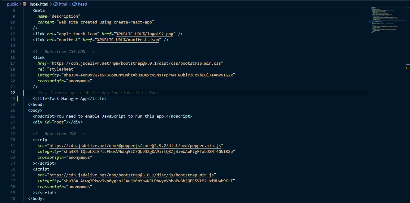
Firstly you will go to the public folder of our app, within the public folder you'll find an index.html file where all our pages and components are rendered as a single page application. Then in the index.html file, paste the CSS CDN link in the head tag and the JavaScript CDN link in the body tag.
CSS CDN Link
JavaScript CDN Link
After pasting the two CDN Link in the necessary places, the index.html file in the public folder should look like this:
Now that our project is setup let's dive into creating our App.
Creating App Components and Styles
Components in React let you split the UI into independent, reusable pieces and think about each piece in isolation.
In this section, we will create all the components that this app consists of, like the Header, AddTask, Button, Task, and Tasks Component.
Creating Component Folder and File Names
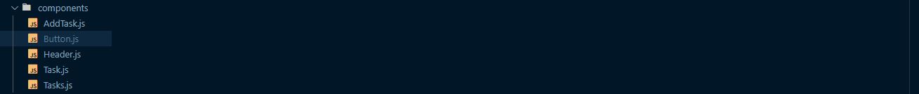
Open the src folder and create a new folder called components, then in the components folder, create the following five files.
AddTask.jsButton.jsHeader.jsTask.jsTasks.js
After creating the five files and components folder, it should look like the one in the image below.
AddTask Component
The AddTask Component will handle the form that takes in new tasks in our app.
Now let's build this component and create the form. The component will consist of a form along with validation for the form.
AddTask Form
This form consists of three input tags which are used for receiving the task name, the day and time, and for submitting the details received. It also consists of some class names which are used for styling the form and making it look very nice.
This form is handled by two states which help us to get the values of the form. In this case, we would be using our useState React Hook because we are using a Functional Component.
note: useState
It is the most important and often used hook when using Functional components. The purpose of this hook is to handle reactive data. Any data that we keep track of over time in the application is called state. When any of the data changes, React re-renders the UI.
Syntax of useState
The first thing is to import this react hook(useState) into our AddTask Component.
After importing this hook, let's create the form in the functional component. So when we fill the form, it is stored in the text and day state, which are empty by default.
Now that we have created our form let's style it and make it look very nice. Open src/index.css and add our styles there.
The form is now set for adding tasks. Let's now do a little validation to restrict an empty form submission and fill in the form's data.
Form Validation
Since our form is set, let's now validate it onSubmit, so when a user clicks on the save task button or hits enter, it should check the form data based on some conditions and alert the user if there is an error.
But before we do the validation, we need to import the alert that will notify the user, which in this case it is the sweetalert2 library that we installed.
The main logic behind the validation is that when the save task button is clicked, the onSubmit function will be called, and as we can see below that inside the onSubmit function, we used a conditional statem ent to check if thetext and day state are empty and if it is empty we want to throw an alert that says "Fill in your task and date or close the form!".
If the text state is empty and the day is available, we will also throw an alert that says "Fill in your task!"
If the text state is available and the day is empty, we will also throw an alert that says "Fill in your date!"
But if both the text and day state are available, then we can call the onSave function we passed as props from our App component, then the text and day state will be passed as an argument into the function.
Then when our form is submitted, we want to set the two states back to an empty string
Note: In case you don't understand the meaning of props, Props are arguments passed into React components, and they can be simply called properties. The main purpose of props is to pass data from one component to another.
At this point of the tutorial, we have successfully created our AddTask Component by creating the AddTask form and validating it based on some conditions stated above.
Your AddTask Component should look like this after following the above process:
Button Component
The Button Component is not very large, but the reason for creating it as a component is so that it can be re-used anywhere else in the app. If you check the App Header, the Add button, which later changes to Close, is the button component, and in this section, we will be creating the button.
In the Button.js file you created in the components folder paste the code below.
In this component, three props (color, text, onClick) were passed into it from the Header Component, which we will create in the next section.
Header Component
The Header Component consists of the App Name, which is "Task Manager App" and the imported Button Component. In this component, we also have two props which are (showForm, changeTextColor), and they are both used to show the form and change the text and color of the button, respectively.
The Header Component will also be styled with the CSS code below:
Task Component
This Component will define the structure of our added tasks. We will build this component according to the user interface in our complete App look.
In this component, we will be using two icons from the React Icons library for the edit and delete features. We will also pass three props which are (task, onDelete, onEdit). The purpose of these props is to show the added, deleted, and edited tasks.
This Component will also come out nice by styling it with the CSS below:
Then let's move to create our last Component!
Tasks Component
This Component is very short and precise. It receives the tasks, onDelete and onEdit props then maps through the tasks, and passing each task down along with the edit and delete functions to the Task Component we created above.
At this point, we are done with building all of the Components of our Task Manager App.
Now we can now move on to adding the CRUD operations and some other minor features to our app.
App Features
The following is the main section of our tutorial. Here we will be adding the CRUD operations.
App.js Set-up
Before we start writing the functions that perform all these features, let's prepare our App.js file by importing all the components and libraries that are needed, and set up the display of our app.
App.js Imports
Navigate to src/App.js. In this file, we need three components that we created in the previous section, the useState and useEffect hooks, as well as the uuid and sweetalert2 libraries.
note: useEffect
It allows us to implement all of the lifecycle methods from within a single function API. It is used majorly when a component renders just like "componentDidMount" in a Class-based component.
After the imports, let's render all the components in our App component, but before we do that, we need to make use of the useState hook to reveal the AddTask Component, and check that we have more than 0 tasks.
An added task will be pushed into the tasks state array.
The showAddTask state is false initially, which means the AddTask form will not show unless it is true, and to toggle it to true, we use the button in the Header Component.
We also pass the function addTask through an onSave prop in the AddTask component. We'll write that function next.
Our App.js is set. Without further ado, let's dive into the features in the order below.
- Creating Tasks.
- Updating Tasks.
- Deleting Tasks.
- Adding the Counter Feature.
Creating Tasks
We created the form component and validated it to make sure the data from the form is correct. So, we just need to write a function that gets the data using the task argument, and then set the tasks state to the form data so that the tasks state can be mapped through and to display the tasks on our page.
- Gets the form data through the
taskargument - Creates a unique ID using the
uuidlibrary - Creates a
newTaskobject with theidand spreadtaskarg - Uses the
setTasksfunctions to add thenewTaskto the end of thetaskstate array - Uses the
sweetalert2library to fire an alert when a task is created successfully
Deleting Tasks
Deleting is one of the core features of the CRUD operation, and in this section, we will build this feature.
We need to delete items by id. So, if I have the id of the item I want to delete, I can filter the list of all items by id and return a list of items without the item with a matching id.
Next thingis to create a function that carries out our delete feature, The name of our function is deleteTask. The id we are passing as argument in the function below is gotten from the Task Component we created above, and below is a code showing it:
So clicking the "FaTimes" icon fires the deleteTask function that was passed down through the onDelete props which was passed down from the App component down to Tasks then to Task.
If a task is successfully deleted, it throws an alert saying, "You have successfully deleted a task!"
Updating Tasks
Like in our delete feature, we will use id to find our unique item and update it. We will also use a window prompt to receive new data from the user so that it can replace the previous data.
In the Task Component, when we click on the edit icon, which was gotten from react icons, it calls the editTask function in the App.js file. So the editTask function was passed into this component as the onEdit prop.
Below is the function that takes in the task id and prompts a user to fill new changes to the task and, before it can get updated, we need to map through our tasks id and get that particular one so that we can set that id's data to the new data we are filling. After this, the task gets updated.
Bellow is the editTask function definition. In the function we assign the text and day variables with values from prompts.
We then map through the tasks state array. If the task's id matches the id argument, we return an object with the new data. Otherwise, we just return the task.
If a task is successfully updated, it throws an alert saying "You have successfully edited an existing task!"
Ready to pick up the pace?
Enter your email and receive regular updates on our latest articles and courses


We're here to help.
Sign up for our FREE email course
- ⭐️ Portfolio Building: Learn how to build a badass developer portfolio so you can land that next job
Adding the Counter Feature.
This is the easiest feature because it is just about getting the length of the tasks state array, so below is a code snippet that shows how to get a count of all tasks added.
Adding the Loading Spinner
In real-world applications where you will use an API, you need to add a spinner/loader that is displayed before your data from the backend is ready to be shown to the users.
In this case, we are not using an API, but for practice, let us add a spinner that loads before our main page renders.
There are a lot of React spinners or loaders we can use but let's use a Bootstrap spinner to keep this app very simple but awesome. This is the link to the Bootstrap Docs where you can find different Bootstrap spinners, and you are free to check out any of them. You can also check out React Spinners like those from the react-spinners library.
We would be adding our spinner to the App.js file because this is where all the components in our application are rendered.
There are just three things to do:
- Create a
loadingstate using React'suseStatehook - Set our loading to false after page renders using
useEffecthook - Put a condition in our page render to check if loading is
trueorfalse.
Setup the loading state. The initial state should be true.
Setting our loading state to false with useEffect after three and a half seconds. This behavior simulates waiting for an API call to return data to us.
Now, we can use a ternary that checks if the loading state is true, if it is our spinner should show and our page won't render yet. If it is false our page will render.
Let’s add little styling to our spinner. Still in the index.css file, we would style the spinnerContainer as shown below:
Using Local Storage
The localStorage object stores data without an expiration date. The data will not be deleted when the browser is closed. In this App, we will be using LocalStorage to store our tasks data so the user has access to them even after leaving the page in any way.
In production you would use a database of some kind but we are using LocalStorage as practice.
We'll be using the following localStorage methods:
Fetching our App Data from Local Storage
Before this section, we were getting our app data from the tasks state, but all our data will be empty once we reload, so in order to persist our data let's set our state with the data in localStorage.
So once the page loads using useEffect, it loads the app data from localStorage.
Saving Added Tasks to LocalStorage
At the end of the addTask function we wrote earlier, we would need to save the data the user is adding by using the above syntax of LocalStorage. So it will look like the code below. Our key is taskAdded and value is newTask.
Our overall addTask function after implementing LocalStorage should look like this:
Updating LocalStorage for Deleted Tasks
We would need to also set the result after an item is deleted to localStorage so that it can be current with our latest changes.
So using the same key but now another value, let's set it to the result of the deleteTask function.
Our deleteTask function should look like this:
Updating LocalStorage for Edited Tasks
We also need to set the result after an item is edited to localStorage so that it can be current with our latest changes.
So we get our data from localStorage, map through it, then edit it the task with a matching id property. Using the same key but now another value, lets set the new data to localStorage with our editTask function. Our app also needs to be reloaded so that our state can carry the latest changes.
Our editTask function should look like this:
At this point, our tasks are being fetched from localStorage. If you edit or delete a task, it will also be updated in localStorage.
Our final App.js file should look like this:
Our Entire App Styles
In our App, we use a general styling like our font-family (Josefin Sans), body styling, and a general container for our app to make it look well across desktop to mobile screens. All the styles we used above will also be there.
So open your index.css file to paste the styles below there:
Resources
Read up on some of the concepts covered in this tutorial in the links below.
Conclusion
In this tutorial, we learned how to build a CRUD App with React and Local Storage, how to set up React with create-react-app, React Hooks, React States, and Props, and I believe that with this article, every reader should be able to build a very nice CRUD App.
Here is a link to the project repo for more guides and the live project.
If you have any questions, you can always send me a message on Twitter, and I will respond.
Ready to pick up the pace?
Enter your email and receive regular updates on our latest articles and courses
We're here to help.
Sign up for our FREE email course
- ⭐️ Portfolio Building: Learn how to build a badass developer portfolio so you can land that next job